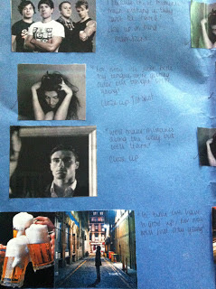
This is the coloured version of my first panel.
Wednesday, 30 January 2013
Photoshop design. (Unfinished)
This is the first step in creating my design in photoshop. I have managed to draw an outline of the album cover in black and white. Some of it is slightly faded in parts.
Tuesday, 29 January 2013
Album cover explanations. (Unfinished)
The main feature of my design is the Eye of Providence. The symbol has been around for centuries and is represented through a lot of religions. The eye is often surronded by rays of light and is enclosed by a triangle. It is used to stray away evil and protect the people. It is also used to decipit the image of God. As my music video is soley based around heaven and hell and the differences, I thought the Eye of Providence would be a great symbol for my digipack as its a representation of both sides in different meanings. (It see's all the good in the world and protects the world from all the bad).
Also in another version of my digipack I have used the Hamsa symbol which holds the same meaning as the Eye of Providence.
The design is very detailed and most commonly found in the Middle East and North Africa. It is used in jewlerry and wall hangings as a sign of protection that also represents blessings, power, and strength, and is seen as potent in deflecting the evil eye. The hand can be depicted with the fingers spread apart to ward off evil, or as closed together to bring good luck.
Again this is a good symbol for the design of my digipack as it has a strong link to the ideologies that run through my music video.
The colours within my front cover are going to be bright and vivid. I want the design to be eye catching and interesting. As the designs I am including are detailed, I want them to stand out from the crowd and capture the audiences' interest straight away. The Hamsa and the Eye of Providence can be linked to Buddhism which again in its images of religion has a lot of colour. For example the Ganesh is detailed and bright which is the same sort of look I want for my digipack.
Sunday, 27 January 2013
My album cover computerized (Mark 1)
This is the original drawing I designed.
This is the computerized version (1). The scanning cut of the edge of the design but this is just a rough idea of what the final version will look like.
This is the computerized version (2). There is a slight difference in the two computerized versions and I think the second picture has more detail than the first.
This is the computerized version (2). There is a slight difference in the two computerized versions and I think the second picture has more detail than the first.
Tuesday, 22 January 2013
Inspiration for Album Covers and Analysis.
I would advise you make the slide show full screen to be able to read the notes properly.
Sunday, 13 January 2013
Album Cover Idea.
This is my first idea for my digipack front cover design for the single "Stay Young" by Dora Nadine.
Storyboard/Moodboard.
I had trouble posting these photos as blogger wouldnt seem to let me upload any of them on the computers, but i have fixed it now.
Labels:
G324 Planning Music Video
Subscribe to:
Comments (Atom)


.png)


